Opal
- Country
- United Arab Emirates
- Category
- Technology
- Year
- 2025
Brand Overview
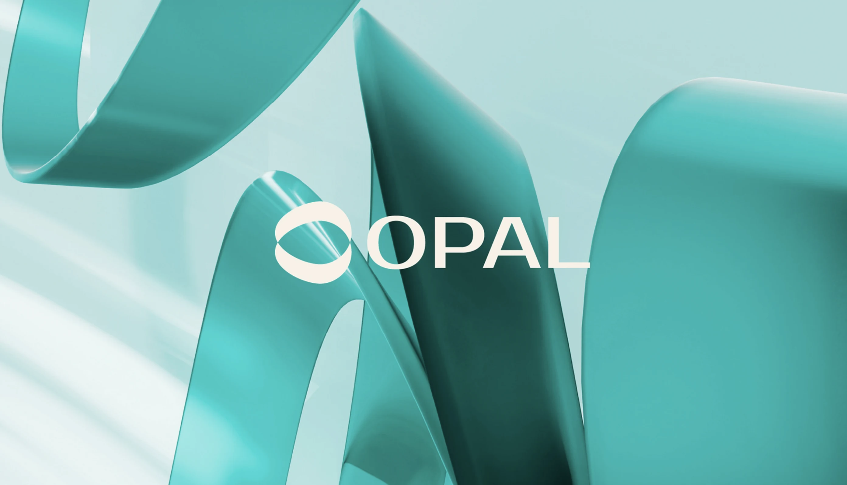
Opal is a technology company that makes complex systems feel effortless. The identity had to express clarity and calm while staying flexible enough for product, marketing and investor communication.
Scope of Work
- Strategy
- Branding & Identity
- Motion
Opal
The Challenge
Technology brands often lean on the same blue gradients and abstract shapes. Opal wanted to feel human and precise at once, and to be recognised instantly across screens, decks and physical spaces.
The Solution
We drew a fluid, ribbon-like mark from the gem’s play of light and paired it with a clean wordmark and a soft teal palette, giving Opal a system that moves naturally from interface to billboard.